Remembering Home in the Spring - An acrylic painting


So this is my newest project - an acrylic painting I'm calling "Remembering Home in the Spring" (I grew up in Knoxville, TN… about 40 miles from the Smokey Mountains - and this scene reminds me of Cades Cove near Townsend, TN)  I've been feeling pretty home-sick lately, with it being spring right now and knowing the dogwoods are in bloom this time of year, I decided to sit down and create something that would be from my heart.

Painting is fairly new to me, so please try to put up with any flaws or strange composition you might find in this piece of artwork…unless you are an artist who can critique it and help me out! I'd love to get feed back.

Anyway, I found 3 photos and included parts of all of them in this painting. I decided to paint this girl looking toward the mountains. (or maybe she's looking at the dogwood tree)…in a field of orange flowers (GO BIG ORANGE)…and I liked the thought of a distant dogwood in the middle of a grassy field…so that's what I did!

I painted this in the course of the last 5 days. It has helped me unwind from the day to day stress at work and just create. I have loved every minute! (Each step shown below was a different day of the week this week.) I have been coming home each day after work, changing my clothes and hanging out in the spare room / make-shift studio. I probably wouldn't have stopped to eat dinner, except that I have such a loving, caring husband who would make something and bring it up to me. (He gets me and understands when I get in these moods!)


I use a combination of Liquitex and Golden Heavy body Acrylics and Golden Open Acrylics (which is a new version of Golden's Acrylics - it dries a little slower than regular acrylics - which helps with blending.) And I use a variety of brushes. I admit I don't know a lot about brushes yet. I just grab whichever one I think will do what I'm wanting…however, by the end of a painting session I'm stuck in front of a sink for a pretty long time cleaning each brush…Maybe I'll learn soon! Hahaha!


DAY 1 (MONDAY)


First I drew in the main things I knew I wanted in the painting (the girl, the distant mountains and more forward trees.) I didn't take a pic of the drawing, sorry! But I used a charcoal pencil to draw it in and made sure it was covered by paint. Then I blocked in the main colors that I wanted. I wanted a bright cheerful day, but I think I would have been happier with a little more grayed out, subtle colors for the background. (But, let's move forward).


DAY 2 - TUESDAY


The next day I worked on the sky (I wanted it to be a pretty spring day…so few clouds…mostly blue. I also put more definition in the distant mountains, but didn't want too much detail since they are far away. (The smokey Mountains look very blue from far away). I also darkened the closer tree line and made little blobs that would look like trees. I placed a tree trunk where I thought I might like a dogwood tree, but wasn't too sure, so I didn't go far with it. I also put some detail in the girls hair and started building it up…I like drawing and painting hair…


DAY 3 - WEDNESDAY


On Wednesday I worked some more on her hair and skin tone on her arm and little bit of face you can see. Skin tone is very hard…I went through some paint trying to figure it out…but I felt pretty good about where it was going…now about that hand….uggghhhh! Oh, and I also darkened the foreground grass…but wasn't too happy with it so it will be changing...


DAY 4 - THURSDAY


So, as you can see, on Thursday I brightened the distant grass a bit, I felt a little better about it, but still wasn't sure if I liked it. I also put a little more darkness in the girls hair, I had added a bit too much highlight in it the day before and now I'm happier! I also put some details in her clothes. I decided on blue to feel a bit cohesive with the sky and mountain colors and because I knew that I wanted orange flowers…and since blue and orange are complimentary colors I felt like it would be the best choice. (What is your opinion?) Below is a close up of the girl…YIKES…that hand! 


DAY 5 - FRIDAY!!!!


Yay! I'm off today and was able to paint as long as I wanted and I was so excited! As you can see my pallet was getting a bit messy! (I will learn how to mix paint easier and stop making such a mess soon, I hope!) So, I put out a new set of paint blobs to start the day. (by the way, I use a stay-wet pallet. I like it, but haven't quite figured out the best way to use it. My paint is either too wet or too dry so far). The colors seen here are Ultramarine blue, Quinacridone Nickel Azo Gold, Naples Yellow, Cadmium Yellow, Alizarine Crimson, Burnt Sienna and Titanium White…but all too soon it looked like below…oh well...


So after I tweaked stuff like the girl's dress and hand…(finally okay with it…though not perfect, I don't hate it anymore!) I also painted in the dogwood and foreground grass. I was pretty nervous at this point. I thought I may have gone too far and too dark, but I knew if I just pressed on it might work out.


Ah, okay…so, maybe after adding a lot of highlights and such into the grass before I painted in the million flowers it wasn't as dark as I thought.


Finished!!! (Above is the side view and below… a close up! - Oh, and did you notice I put a flower in her hand…aren't I clever?! (Although it makes you look at her hand a little too closely…so maybe not so clever…LOL)


I hope you've enjoyed going on this painting journey with me as much as I've enjoyed it. I know that I have a lot to learn…but I'm enjoying figuring it out. I've learned a lot from You Tube! There's one person I subscribe to that I've learned so much from - Will Kemp Art School…search for him on YouTube - he's a great teacher!


GOD BLESS YOU!


Newest Portrait

This is my most recent portrait drawing. I had drawn this client's cats a couple of years ago before she had any children. I was so excited when she called again to ask me to draw her little cutie! He is drawn using graphite pencil on Strathmore bright white paper.


New Artwork...Just for fun!

I've been working on some new art work...some experimental and some practice...but all FUN! I won't write a lot about it, I'll just let you enjoy!

#1 - My Favorite Park
This is a colored pencil drawing. I used mostly greens, browns and grays to draw, (with circles), a very beautiful little walking park near my apartment in Lake Mary, FL. I love walking here and listening to my favorite music and thinking about Heaven. I'm sure it has a lot of very similar parks everywhere! I imagine them being a lot more colorful, though...so I may draw this park again with more experimental colors.


#2 - Peace at the Wall
This is a pastel painting that I did while thinking about praying for Jerusalem. I'm sure it has been done before, but, I really was just thinking about the peace of the Lord descending on those praying at the Western Wall. I may try it again as well, making the dove a little smaller and people praying at the bottom...who knows!
It's drawn on beige velour paper.


#3 - A fun Menorah
I love the colors in this painting done with pastels on beige velour paper. I love the combination of bright greens and purples in the painting. It's meant to be fun and have a sense of joy. It is also sort of abstract with the shape and angle being not so realistic. I may use this painting to make cards during the holidays next year. What do you think?


#4 - Dancing for Joy
Again, this painting is not necessarily suppose to be realistic. I am just learning how to paint and draw just for the joy of it. No one may like them...but that's not the point. I really enjoyed it and I'm hoping that comes across! I'm really not as happy with the choice of colors, but I enjoyed painting it just the same. It's also pastels on velour paper.


#5 - Oranges...mmm
I have really been enjoying oranges lately. I love the taste of oranges, but if I'm having a stressful day the smell of orange peels can really make me happy. So I decided to try out some new oil pastels (similar to crayons) and draw my favorite food...like I said, it's just about the joy of it!


#6 - Ballerina's POINT of view
Last, but not least, is the colored pencil drawing that I did of a ballerina's feet on point. It was just something I wanted to draw. It is more realistic, though probably not perfect! I will definitely try this one again. However, I enjoyed it...and that's what it's about!


Thanks for reading my blog...please comment below and share with anyone you think may enjoy it and I promise to post more often! Blessings!!!

The Little Birthday Girl

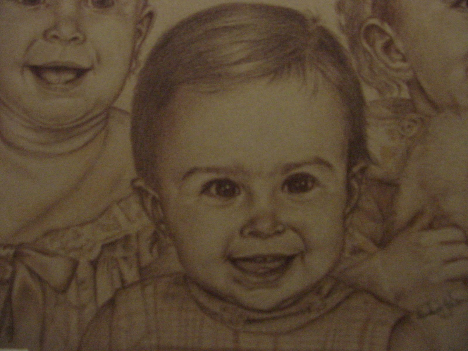
This is a cute little girl who is turning one in a few days. She's the god-daughter of my client. I drew her using graphite on white Stonehenge paper. I also used a little pink color on her ribbons, her shirt and her lips. The portrait is a 9x12.

I enjoyed drawing this cutie and hope I get to do this more often!!! Again, the portrait looks a lot better than the photo of it. I will be investing in a good camera soon! The background should be white...not gray!

Portrait:


Here's the original photo:


Cuteness!!!

I've been working on a portrait of the cutest little red-head. This was a done for a winner of a blog contest for the Housework Haters Club blog. It was drawn on Stonehenge paper (my favorite paper to draw on) using Graphite. I added a little tinted graphite on his hair and cheeks and a little in the water. I'm not sure you can see the color...I've had trouble with getting the best pictures of my portraits. If anyone has any suggestions on how to get good photos of artwork let me know!!!

Here's the portrait:


And here's the original photo:

Where have I been?....a little bird crazy!

Well, it has been a really long time since I've blogged..."Where have you been?" you may ask me. I've been a mom for the past 6 or so months and not much else! I won't go into the details, but I will say that I'm back and ready to draw and blog and write and ....well, whatever God has for me!

I do want to share a few of my latest drawings and paintings with you and also share my brand new website. I have an easier domain name and I'm pretty proud of how it all looks! It's at www.melhowardart.com

Thanks for not giving up on me! And God bless!!!!

(Here's that new art..I've been a little bird crazy)


Sunshine the Dog...Final

Wow! The Holidays have been really busy this year! I had promised to show progress on each portrait, but I've been doing so much this year that I haven't gotten a chance to show you these last few portraits as they progress. But I thought I'd show you the end result of this one. It's a beautiful dog named "Sunshine".

It's another Christmas gift...so shhhh!

Sunshine is sitting in the "Sunshine"....heehee...so she appears to be a little lighter in color than she appears in some of the photos the client sent me. But I really love drawing pets and people sitting in the sunshine and in the grass. I hope the client loves it!

Merry Christmas to all!


Here's the portrait - 20"x24" Pastels/Tinted Charcoal on Mat Board
(colors may look different based on photo & quality of computer)


Close up of her face.


Original Photo

Drawing Progress - Horses - All done!

I'm done! The horses turned out pretty cool. I like them and hope that the person receiving it for Christmas is going to LOVE it! I never want to do anything else...I really enjoy this! All I have to do is spray it with a final fixative and deliver it!


Drawing Progress - Horses

I have been promising to update clients on my drawing progress...and I've let up a little...only because of the holidays and art shows. But, enough with the excuses...

When a client asked me to draw horses for her, (as a Christmas gift to her daughter...one horse has passed away and the other she has now...both very special to her), I was really thrilled. Horses are one of the most beautiful creatures that God ever designed. And drawing them is one of my favorite things to do.

As I began to draw the first horse, Ned, my intention was to use tinted charcoal. I love the look of it...it's very subtle. But I found that nothing but trouble was in store for me. The tinted charcoal only comes in wooden pencil form.  But because charcoal is so fragile and crumbly...well, as you can probably guess, each time I went to sharpen them the lead just busted up. The result was a red face and scowling eyes. (not the drawing...ME). As a result of this struggle I now own many different kinds of pencil sharpeners...electric, hand crank, little ones, big ones, expensive ones and cheap ones...so if you need to borrow one I'm your gal! I also tried my hand at whittling, which my brother taught me how to do one night sitting by a bon-fire...but, nope, that didn't work either!

I struggled for days...until I realized that the tinted charcoal was really similar to my pastels...which are not pencils, but the hard chalk type that can be sharpened by using sand paper. Or if you are blessed to have a relative in the dry-wall business he can hook you up with some dry-wall screen. I have a small square of it which I wrapped around the bottom part of a pastel box. I use the top of the box to hold it onto it. Then I can sharpen the pastels while the "dust" goes into the box. When I'm done I just turn the top back around to close the box until next time. (Just a little hint for you pastel artists and artists to be).


Okay, so I started using the pastels...and yay! I got my "art mojo" back. It's that thing that just comes over me and says...okay...yes...this is looking how I wanted. No more struggling. Whew! So I have the first horse done (mostly)...and then I have a second horse in a similar pose (jumping) for the other side of the page. I am going to tweek this first horse after I've started the other, but for the most part he's finished.

The picture that the client provided is very sharp and clear, but really small. So here's another tip...scan the picture and enlarge it. (You can't tell here, but the enlargement is blurry when it comes to details). So I bought a really great magnifying glass that hangs around my neck. When I want to see detail more easily I look at the original and it works nicely!

I will be drawing the other horse starting tomorrow...so check back again soon!!!


Pastels on a brown mat board 20"x24"

Drawing Progress-Sweet Little Girls - Final


I'm done! As you can see...I decided on keeping the bear in the Sister #3's portrait. She just looked lonely without it. Her dress did not work without the bear sitting in front of it either. Although I did draw it in as softly as I could so as to not take away from the adorable faces of the girls.

I hope that the client loves what I did. I enjoyed drawing these beautiful girls and hope to get many more clients who have other little ones for me to draw!

More portraits to come starting next week...Whew!!! I will actually be drawing horses! So check back after Thanksgiving! Happy Holidays!

Close Ups:

Drawing Progress-Sweet Little Girls - #3


Today I am posting #3 in the drawing progress I'm doing on the three sweet little sisters. I'm nearly done with the first sister and now the second. I have drawn in the shadows of her face to bring out it's shape and put detail into her clothes.

I will be tweaking her eyes to make them a little softer and softening the shadows in her face. she is drawn a little darker to bring her forward in the portrait. Doesn't it give the illusion of her sitting in front of her siblings?(Giving the portrait depth).

I will be finishing this portrait by the weekend. Hope you come back to see the final result!

(btw...please excuse the photography, I am having a little trouble with my camera...thanks!)

Drawing Progress-Sweet Little Girls - #2


Okay, so far I have nearly completed Sister #1. She is a beautiful little girl and bringing her face to life using my Derwent Colour Soft (Brown Earth) pencil was a blast. I cannot wait to finish drawing her and completing the other two. As you may be able to see in the above picture I have drawn in the shadows and details that make a subject become more realistic. She pops out of the portrait!

I have a little tip, (for anyone who doesn't already know it)...when you are drawing, one of the best ways to see if there are any areas that need improvement in your drawing is to take a picture of it and look at it on your computer screen. I have no idea why it's so easy to see little areas to tweak, but it is. So looking at this picture of Sister #1 is driving me nuts! I didn't see those things before, but now I see what needs to be tweaked!

I have also started on Sister #2's hair. Hair can be very difficult and takes a lot of patience...especially if it is dark hair. (Layering color is the key). I still have plenty to do on her hair and then it is to the shadows of her face (my favorite).

Stay tuned!

Drawing Progress-Sweet Little Girls

Well, it's been a few weeks since I posted to this blog. I've been in an art show and sale (I'll blog about that later), and gotten several commissions. This blog is to update and show a progress of a drawing I'm doing for a client. She's having me draw a portrait of her boyfriend's girls.

Shhhh...it's a birthday surprise!

Here's a picture of the girls, all at the age of about 12 months old...at different times. I will call them baby one, two and three (from left to right).


Cute, huh? Well, I had a couple of things to work through. The client wants to have the girls on one portrait as if they had actually posed together. (I've done that many times for clients...so I didn't sweat it...) The girls all have the same beautiful smile, so that is working for me!

The sisters #1 and #2 are facing the same direction, though cropped differently. #3 sister is facing a different direction and holding a bear that covers her chin.

THE DRAWING SO FAR: (16x20 on Caslon /Artigan paper)


So  here is the drawing so far and how I have dealt with any of the above listed dilemmas. (The warped appearance is because of my camera...The portrait is straight and not bowed. And there is light reflecting on their eyes slightly which may look strange)... I have drawn them in a triangle lay out.

I sized the portraits of each of the girls to be as similar as possible. (With the middle girl slightly larger to simulate her "sitting" closer to the viewer). I flipped the sister #3 so that they are all looking in the same direction. And I have not added the bear that #3 is holding, I think it will look much cleaner and less distracting with the bear not there.

The only detail I've done so far is the sister #1's dress and bow (bottom left corner). And I've drawn in each of their eyes. The eyes are the most important to a portrait to capture the subject's personality and looks. I've just begun and have a lot of tweaking to do. This is actually the ugliest part of a portrait and I cannot wait to get further!

Watch for more progress drawings in the next few days!

Graphite Pencil-vs-Charcoal


I love drawing...though I haven't drawn all my life, I feel like I have. The biggest problem is figuring out what I love drawing WITH the most. It's like a kid being let loose in FAO Schwartz to play with whatever she wants to. I love finding new things to draw with and figuring out how to use them. Though I use, and love, pastels and colored pencils, I'm only going to discuss graphite pencils and charcoal...their history and interesting tid-bits. Then I'll talk about my opinions and preferences...and I'd like to hear about yours.

GRAPHITE - The History & Other Interesting Tid-Bits

Did you know that the core of a pencil is not really lead, though we call it that? Lead was used in early styluses. The core of a pencil is actually made from nontoxic graphite. Graphite started being used following the discovery of a large graphite deposit in Borrowdale, England in 1564. Graphite left a darker mark than lead, but was so soft and brittle that it required a holder. At first, sticks of graphite were wrapped in string. Later, the graphite was inserted into wooden sticks that had been hollowed-out by hand! The wood-cased pencil was born.

Interesting tid-bit: The first mass produced pencils were not painted. They wanted to show off the wood casings, but soon they started painting the casings. And the reason that most hexagon shaped pencils are yellow is because in the 1800's the best graphite came from China and the color yellow represented a regal feeling associated with China.

You can now get artist graphite pencils in a full range of densities ranging from 9B (softest) to 9H (hardest)...with the softest making the darkest marks. You can also find it in large chucks for covering large areas.

CHARCOAL - The History and Other Interesting Tid-Bits


In early years charcoal was used as a preliminary tool to sketch quickly. It was much too easily smudged and was very messy, so it was normally painted over or drawn over with other media.

Charcoal can be obtained in sticks, pencils, chunks, vine and compressed charcoal. Most artists prefer vine or willow charcoal - which is made by burning wood into soft, medium and hard consistencies. It's easy to use and is versatile. Willow charcoal can come thin or very thick.Compressed charcoal is not as messy as the uncompressed vine and willow charcoal. It is made with charcoal powder mixed with gum binder compressed into round or square sticks. It comes in different hardnesses like graphite. You can also get charcoal in pencil form with a variety of hardnesses as well - better used with a thicker, sturdier paper. These can be bought individually or in sets.

The early origins of charcoal drawings can be found in France. Primitive drawings of bulls and horses that are believed to be drawn with branches and sticks burnt at the end lines the walls of a cave.

MY PREFERENCE

Graphite - The Pros and Cons

Bored yet?...Well...this is where I give my opinion...I like them both. However, I will try to give my opinion of the pros and cons of each.

* The Pros of Graphite: This was my first drawing tool...it usually is for most artists...Graphite has such a smooth even feeling and it is so much easier to get the detail desired in some works of art, especially portraits. I think graphite blends well. Whether using a blending stump or just using a gradation of hard to soft in order to blend, they can easily make your subject have a life-like or photo-like appearance. Pencils are also easy to hold and use without being messy. They are easily transportable and don't require much else when you want to head out to the park to draw or sketch.

* The Cons of Graphite: There aren't many to me. If using a kneaded eraser to pick out highlights, graphite is not as forgiving. If you make a mistake or get pencil marks on your paper where you didn't intend to, it can be difficult to erase it. And one other thing that I'm not as crazy about is that it's hard to get dark areas as dark as I want without becoming shiny.

Charcoal - The Pros and Cons

* The Pros of Charcoal: I love the "feeling" I get when using charcoal. It's goes onto the paper so easily that you feel you can freely swipe your paper and draw the world! (Boy, did that sound corny?) I like the vine and willow form of charcoal, personally. You can use your sanding block to make it nice and sharp or use the side for a broader stroke. It's really easy to manipulate. And one of my most favorite things about charcoal is the darkness you can achieve with it. When I want a dark black, it obliges me without becoming shiny like graphite.

* The Cons of Charcoal: Charcoal is very sensitive. When I'm drawing with graphite I can easily work without worrying about smudging my work. My hand can rest about anywhere on the paper, if I'm careful. However, Charcoal isn't as forgiving. I feel that my hand is doing acrobatics to keep from smudging anything. Almost like "Twister for fingers". And I'm always worried about my 10 year old getting too close to my artwork and brushing against it or touching it.

IN CONCLUSION

In the end, I really enjoy both of these tools when drawing. They are so different and are both fun to work with. I think determining which one I want to work with has to do with either my mood or the subject that I'm drawing. (And sometimes the size of the artwork. - because graphite is easier to get detail done and charcoal is best with larger and free flowing work).

Have you tried both mediums? Which do you prefer? And Why?